Getting Started: Changing the way we view the world
“Maps are like milk: their information is perishable, and it is wise to check the date.”
“Like guns and crosses, maps can be good or bad, depending on who’s holding them, who they’re aimed at, how they’re used, and why"
Mark Monmoneir, Syracuse University of Geography
Author of How to Lie with Maps
How do the maps you look at,
impact the way you see the world?
Watch the video and then check it out for yourself! Take a few minutes to explore this mapping tool which helps show the problems with the Mercator map. What happens when you type in "Russia" and move that country south to the equator? What happens when you type in "Dem. Rep. Congo" and move it north over Europe? What happens when you move Brasil over the United States?
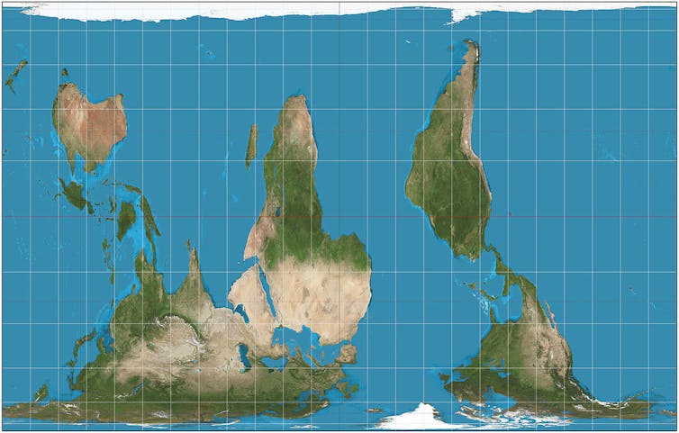
North is up, right? Only by convention. There’s no scientific reason why north is any more "up" than south. Equally, we could do east-up, west-up, or any other compass bearing. The world is round! Purposefully reversing the typical way world maps are drawn has a similar political/psychological effect to using the Peters projection--putting countries in the southern hemisphere at the top of the map appearing to give them greater significance.
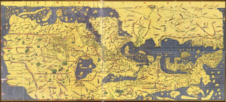
But some of the first known world maps routinely did put south at the top. For example, in 1154 Arab geographer Muhammad al-Idrisi drew a south-up map of Europe, Asia, and northern Africa for his book the Tabula Rogeriana. The Arabian Peninsula can be seen in the center of the map but, of course, pointing upwards rather than the more familiar downwards. Do you see it?
But some of the first known world maps routinely did put south at the top. For example, in 1154 Arab geographer Muhammad al-Idrisi drew a south-up map of Europe, Asia, and northern Africa for his book the Tabula Rogeriana. The Arabian Peninsula can be seen in the center of the map but, of course, pointing upwards rather than the more familiar downwards. Do you see it?

Another convention of the maps we are familiar with is that they are centered on the prime meridian, or zero degrees longitude (east-west). The familiar meridian-centered map conveniently places the map edges down the middle of the Pacific Ocean so no continent is chopped in two. But this is scientifically arbitrary, deriving from the location of the Royal Observatory in Greenwich, London. The result is that Europe is at the top and center of the conventional world map – a rather colonial perspective.

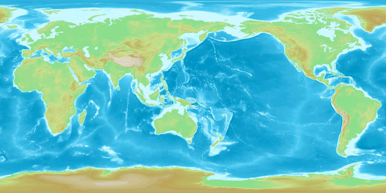

But maps centered on the Pacific Ocean also work well because the edges of the map conveniently run down the middle of the Atlantic. This places east Asia in a more prominent position and pushes Europe to the edge. Students in Oceania and Asia use Pacific-centered maps, so they learn to view the world this way.
Our meridian-centered view of the world shapes how we refer to world regions. “Far East”, for example, implies far from Greenwich, London. Seeing Europe on the left of a map and the Americas on the right can seem counter-intuitive, but it is just as correct as any other arbitrary chop point. Again, the world is, after all, round.
But wait, there is more!
Azimuthal polar projection
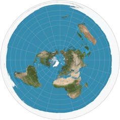

All the projections we’ve discussed so far tend to put one continent in the middle of the map, giving it greater prominence over the others. An alternative is to place the North Pole in the center. It is strangely disorienting to gaze on the world from a polar perspective. The lower hemisphere should be hidden from view by the curve of the Earth because you can only see half a sphere at a time.
But on the azimuthal polar projection from the north, the southern hemisphere has been pulled into view on the page, with the consequence that Antarctica centrifuges into a doughnut around the edge of the circular map. This highlights the disadvantage of the projection as it distorts both the area and shape of landmasses, but distances from the North Pole are accurate in all directions, with those further from the center becoming more enlarged on their east-west axis.
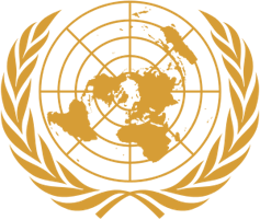
This “azimuthal” polar projection is depicted on the United Nations flag. North America was prominent on the initial 1945 UN flag (which had the longitude line 90 degrees west pointing upwards). The following year, the map on the flag was reoriented to be more neutral by having the international date line (180 degrees east, lying in the middle of the Pacific Ocean) pointing upwards. The map stops at latitude 60 degrees south, meaning Antarctica does not appear.
Credit to Donald Houston from the University of Portsmouth for this article.
https://theconversation.com/five-maps-that-will-change-how-you-see-the-world-74967
Comments
Post a Comment